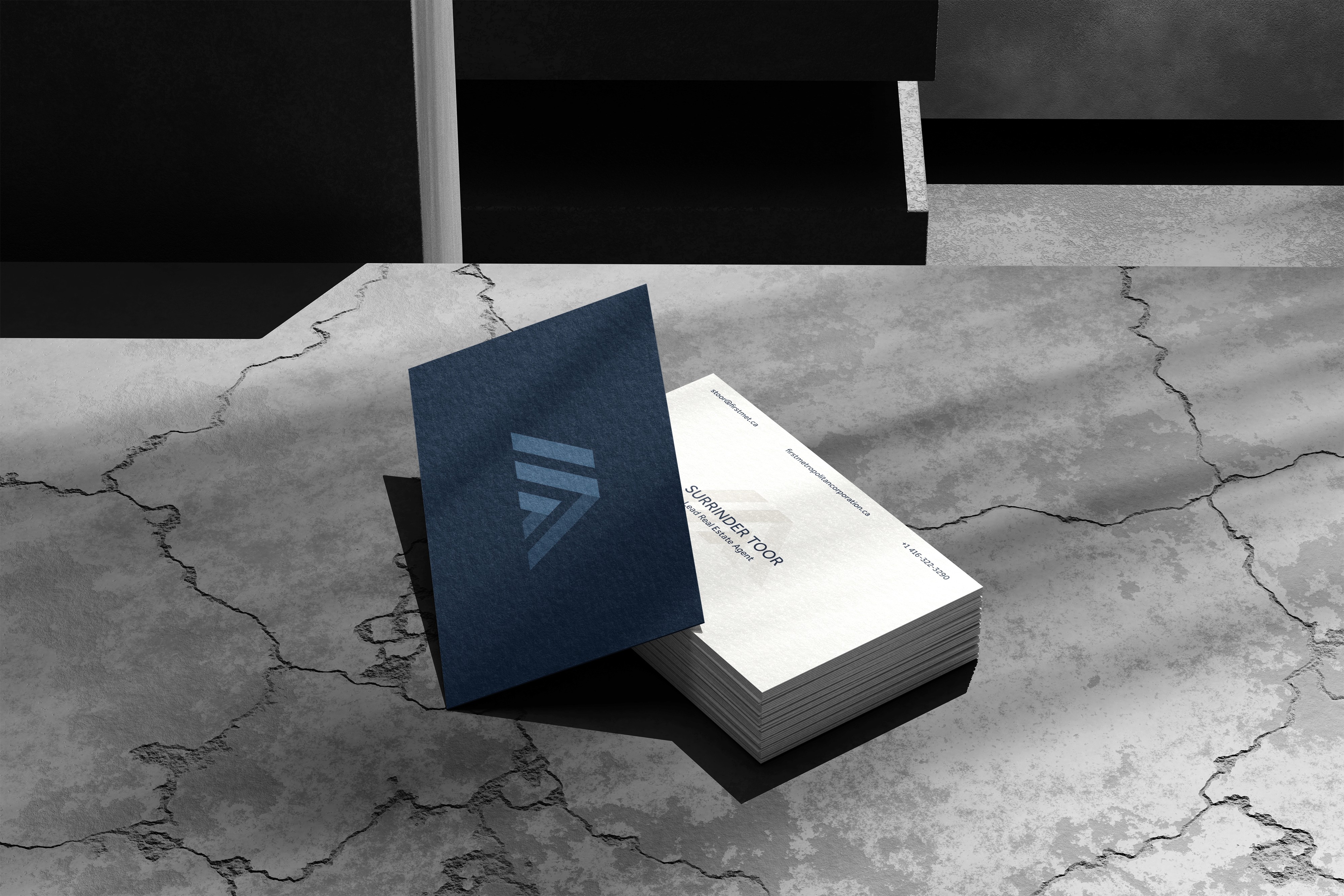
First Metropolitan Realty
In this rebrand, I aimed to bring clarity and cohesion to the respected legacy of the Toronto real estate brand First Metropolitan Realty. The result is a modern, trustworthy identity system built to stand out in today’s market.
Challenge
Results
Logo Mark Analysis
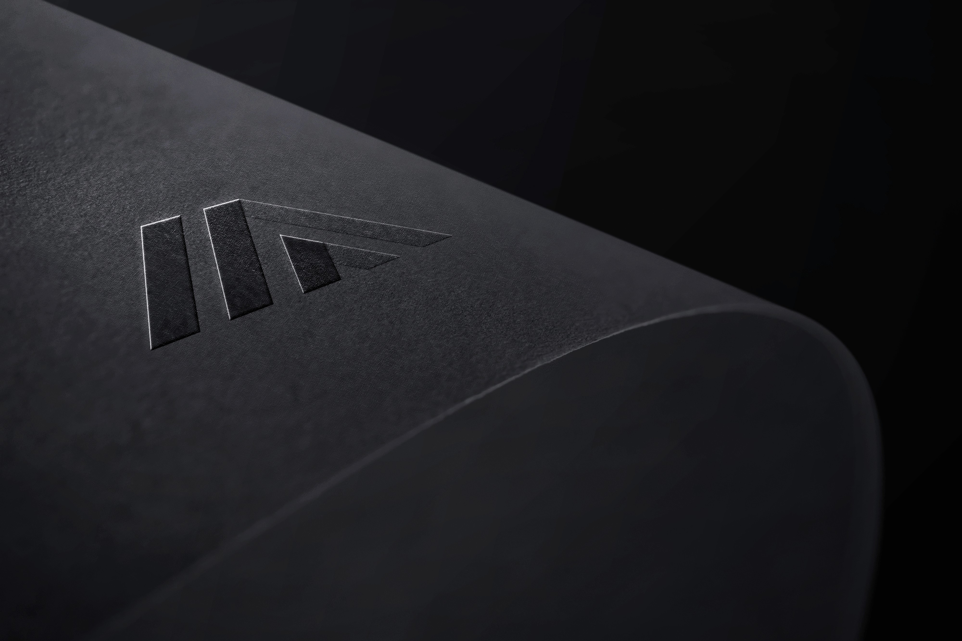
Each element of the First Metropolitan logo has been intentionally crafted to balance brand legacy with clarity, symbolism, and market relevance in the real estate space.
M Letterform
The angled shapes form a stylized “M” for Metropolitan, with converging strokes that represent partnership and growth. The design balances the strength of the “F” while pointing upward to reflect ambition and a modern outlook.
F Letterform
The left diagonal shape takes inspiration from the letter “F” for First, anchoring the brand’s identity. Its upright slant conveys initiative, leadership, and forward thinking, while the bold stroke serves as a strong foundation for the overall design.
Upward Stripes
Taken from the original logo, the three ascending lines symbolize momentum, progress, and client success. They also suggest positive real estate trends, from rising value to ongoing growth and development.
Pillars of Support
The symmetrical vertical lines represent structural support and reliability. These visual “pillars” reinforce the brand’s commitment to stability, expertise, and trust in real estate.
Imagery
The overall mark subtly forms a roof and doorway—familiar elements of a home. This grounds the abstract design in real estate, making it instantly recognisable, relevant, and emotionally engaging.
Colour Psychology
See what I can do for your brand.
Book a call with me today to get started.


