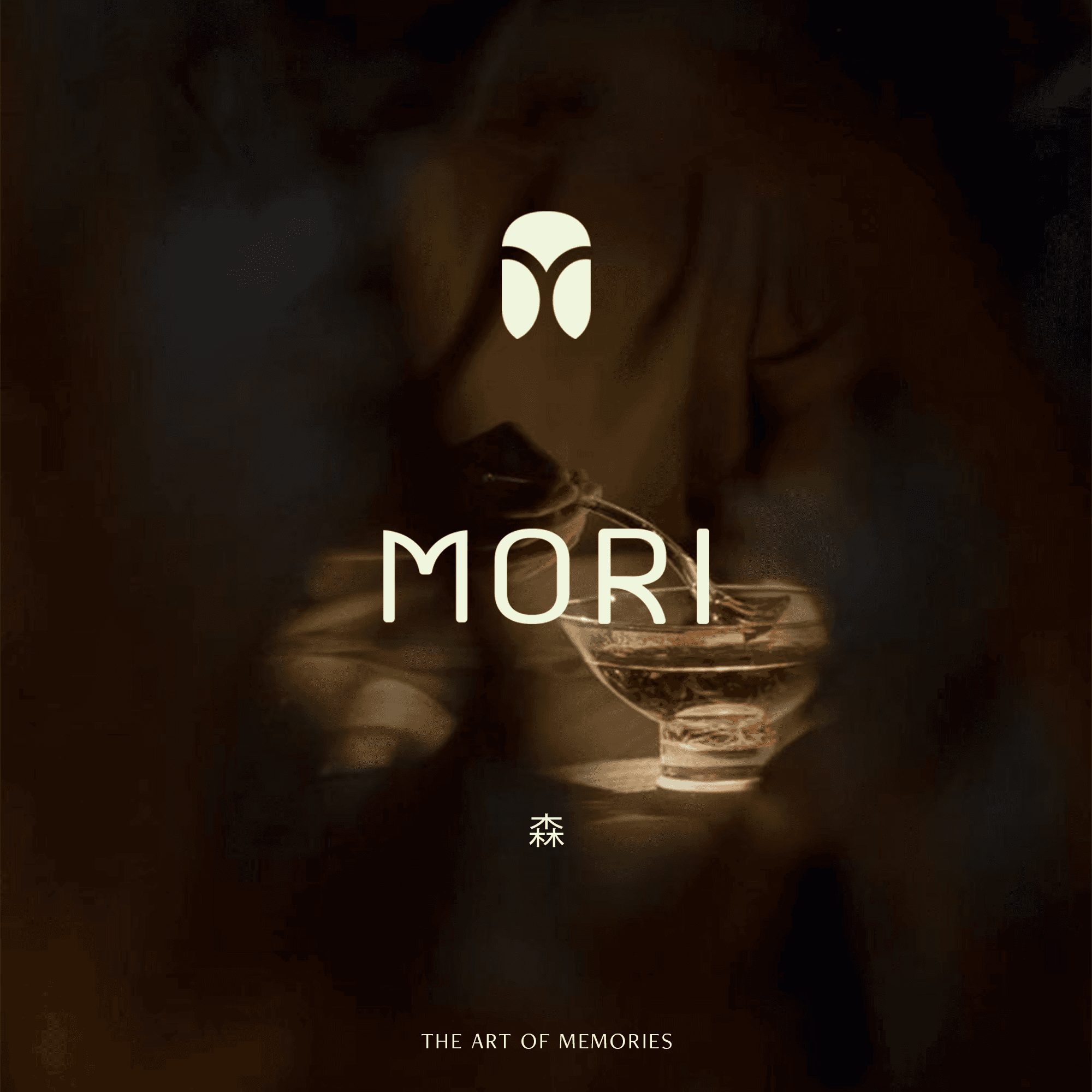
Sushi Mori
I created this conceptual brand identity as a mockup to showcase my design process and style. Sushi Mori is a fabricated restaurant, whose brand system I designed to reflect the quality of a premium sushi restaurant.
Company
Sushi Mori
Industry
Fine-Dining
Challenge
For this conceptual case study, Sushi Mori was imagined as a premium sushi brand blending modern minimalism with authentic tradition, needing an identity that felt refined, warm, and rooted in heritage.
Results
We designed a quiet, confident identity with a custom wordmark, earthy coastal palette, and refined typography—positioning the fictional Sushi Mori as a premium culinary destination grounded in nature and craftsmanship.

Symbol Breakdown
Logo Mark Analysis
Each element of this conceptual logo was created to reflect Sushi Mori’s imagined values of precision, heritage, and connection, telling a story of craftsmanship, culture, and unity.

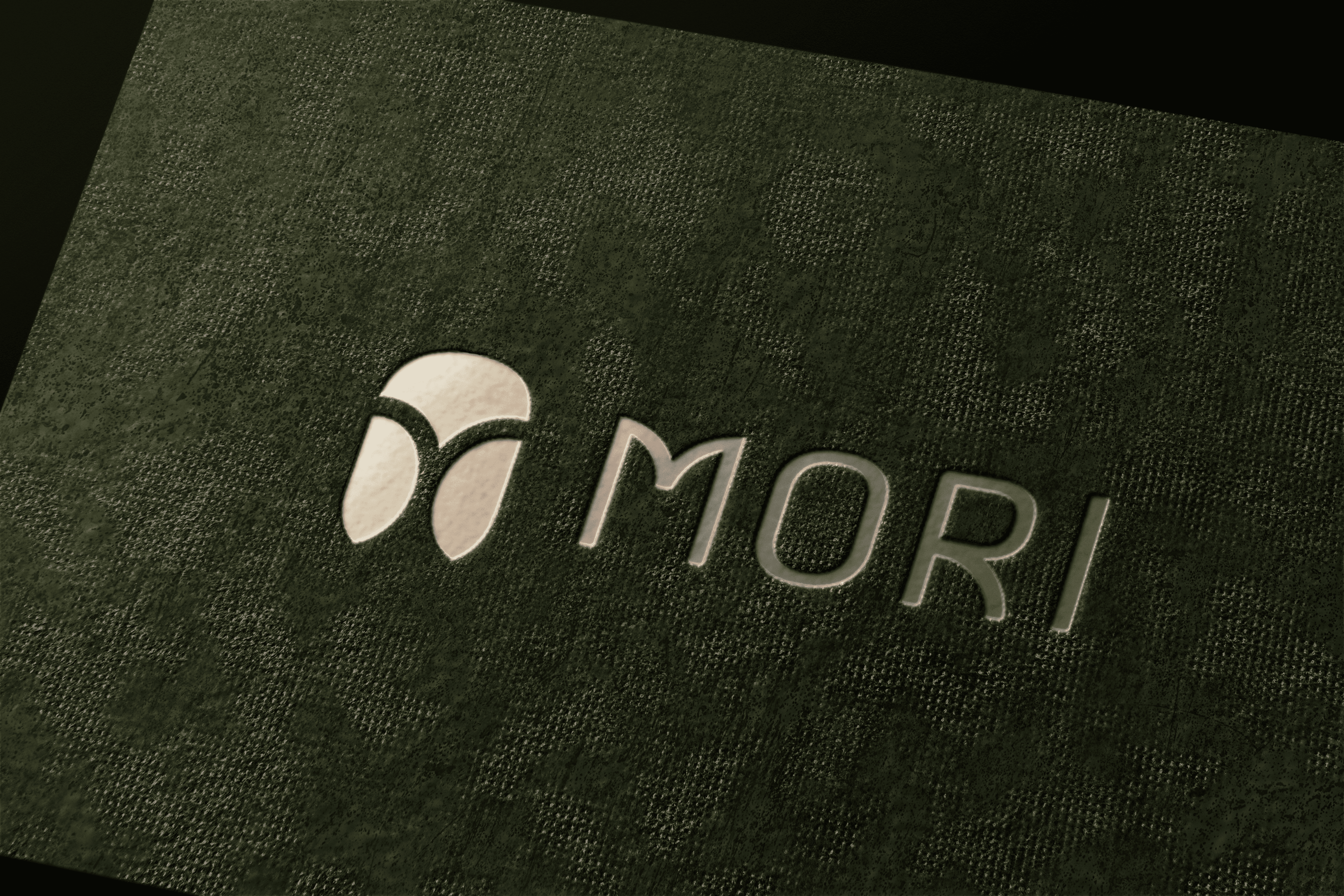
The Sushi Mori logo mark combines cultural symbolism with a refined, modern aesthetic. At its center, the head of an owl, shaped from an abstract fish scale, honours the precision and artistry of sushi. Stylized wings, inspired by traditional Japanese engimono or lucky charms, add movement and cultural depth, while the negative space reveals branching roots that represent growth, grounding, and partnership. Designed to be striking from a distance yet rich with meaning up close, the mark blends heritage and modernity, giving the brand a memorable and sophisticated presence across all imagined touchpoints.
Glyph Conceptualization
Typography Breakdown
Crafted with precision and subtle warmth, the Sushi Mori wordmark and supporting type system express refined minimalism, quiet luxury, and lasting clarity.
Primary Font: Maven Pro
Secondary Font: Lato
Colour Design
Colour Psychology
Rooted in the meaning of “MORI,” the palette draws inspiration from the calm balance of forest and coast. Earthy neutrals and moss greens ground the brand in a sense of stillness, while soft sand and sun-washed tones bring warmth and openness.
This balance between land and sea mirrors the philosophy of sushi. The result is a versatile, refined colour system that feels modern yet timeless, adaptable across digital, print, and interior applications, and well suited to an elevated Japanese dining experience.
See what I can do for your brand.
Book a call me today to get started.
Book Your Consultation
Sushi Mori
I created this conceptual brand identity as a mockup to showcase my design process and style. Sushi Mori is a fabricated restaurant, whose brand system I designed to reflect the quality of a premium sushi restaurant.
Challenge
For this conceptual case study, Sushi Mori was imagined as a premium sushi brand blending modern minimalism with authentic tradition, needing an identity that felt refined, warm, and rooted in heritage.
Results
We designed a quiet, confident identity with a custom wordmark, earthy coastal palette, and refined typography—positioning the fictional Sushi Mori as a premium culinary destination grounded in nature and craftsmanship.
Symbol Breakdown
Symbol Breakdown
Logo Mark Analysis
Each element of this conceptual logo was created to reflect Sushi Mori’s imagined values of precision, heritage, and connection, telling a story of craftsmanship, culture, and unity.
The Sushi Mori logo mark combines cultural symbolism with a refined, modern aesthetic. At its center, the head of an owl, shaped from an abstract fish scale, honours the precision and artistry of sushi. Stylized wings, inspired by traditional Japanese engimono or lucky charms, add movement and cultural depth, while the negative space reveals branching roots that represent growth, grounding, and partnership. Designed to be striking from a distance yet rich with meaning up close, the mark blends heritage and modernity, giving the brand a memorable and sophisticated presence across all imagined touchpoints.
Glyph Conceptualization
Glyph Conceptualization
Typography Breakdown
Crafted with precision and subtle warmth, the Sushi Mori wordmark and supporting type system express refined minimalism, quiet luxury, and lasting clarity.
Primary Font: Maven Pro
Secondary Font: Lato
Why it works
Modern Professionalism
The custom MORI wordmark was designed to feel confident, clean, and premium—aligned with the expectations of sophisticated, design-conscious diners.
Clarity and Accessibility
Every letterform in the wordmark is crafted for legibility across scales and mediums. Its simplicity ensures clarity whether embossed on textured paper or viewed on-screen.
Mark Balance
The curvature at the base of the “M” mirrors the fish scale motif in the logo mark—subtly linking the typographic and visual systems through shared form language.
Timelessness
Built from geometric foundations, the letterforms feel contemporary yet enduring. The proportions avoid trendiness, reinforcing the brand’s long-term positioning.
Typeface Charasteristics
Sans-Serif
We chose a sans-serif approach to convey modernity and refinement. It offers neutrality and restraint—allowing the brand’s tone and experience to take center stage.
Low-Contrast Strokes
The consistent stroke weight and softened terminals add an organic, almost handmade warmth—balancing formality with approachability.
Letterspacing
Subtle spacing adjustments bring air and rhythm to the wordmark. This gives the typography a sense of calm precision—essential to Sushi Mori’s visual language.
Colour Design
Colour Design
Colour Psychology
Rooted in the meaning of “MORI,” the palette draws inspiration from the calm balance of forest and coast. Earthy neutrals and moss greens ground the brand in a sense of stillness, while soft sand and sun-washed tones bring warmth and openness.
This balance between land and sea mirrors the philosophy of sushi. The result is a versatile, refined colour system that feels modern yet timeless, adaptable across digital, print, and interior applications, and well suited to an elevated Japanese dining experience.
See what I can do for your brand.
Book a call me today to get started.
Book Your Consultation
Book Your Consultation
Sushi Mori
I created this conceptual brand identity as a mockup to showcase my design process and style. Sushi Mori is a fabricated restaurant, whose brand system I designed to reflect the quality of a premium sushi restaurant.
Company
Sushi Mori
Industry
Fine-Dining
Challenge
For this conceptual case study, Sushi Mori was imagined as a premium sushi brand blending modern minimalism with authentic tradition, needing an identity that felt refined, warm, and rooted in heritage.
Results
We designed a quiet, confident identity with a custom wordmark, earthy coastal palette, and refined typography—positioning the fictional Sushi Mori as a premium culinary destination grounded in nature and craftsmanship.
Symbol Breakdown
Logo Mark Analysis
Each element of this conceptual logo was created to reflect Sushi Mori’s imagined values of precision, heritage, and connection, telling a story of craftsmanship, culture, and unity.
The Sushi Mori logo mark combines cultural symbolism with a refined, modern aesthetic. At its center, the head of an owl, shaped from an abstract fish scale, honours the precision and artistry of sushi. Stylized wings, inspired by traditional Japanese engimono or lucky charms, add movement and cultural depth, while the negative space reveals branching roots that represent growth, grounding, and partnership. Designed to be striking from a distance yet rich with meaning up close, the mark blends heritage and modernity, giving the brand a memorable and sophisticated presence across all imagined touchpoints.
Glyph Conceptualization
Typography Breakdown
Crafted with precision and subtle warmth, the Sushi Mori wordmark and supporting type system express refined minimalism, quiet luxury, and lasting clarity.
Primary Font: Maven Pro
Secondary Font: Lato
Why it works
Modern Professionalism
The custom MORI wordmark was designed to feel confident, clean, and premium—aligned with the expectations of sophisticated, design-conscious diners.
Clarity and Accessibility
Every letterform in the wordmark is crafted for legibility across scales and mediums. Its simplicity ensures clarity whether embossed on textured paper or viewed on-screen.
Mark Balance
The curvature at the base of the “M” mirrors the fish scale motif in the logo mark—subtly linking the typographic and visual systems through shared form language.
Timelessness
Built from geometric foundations, the letterforms feel contemporary yet enduring. The proportions avoid trendiness, reinforcing the brand’s long-term positioning.
Typeface Charasteristics
Sans-Serif
We chose a sans-serif approach to convey modernity and refinement. It offers neutrality and restraint—allowing the brand’s tone and experience to take center stage.
Low-Contrast Strokes
The consistent stroke weight and softened terminals add an organic, almost handmade warmth—balancing formality with approachability.
Letterspacing
Subtle spacing adjustments bring air and rhythm to the wordmark. This gives the typography a sense of calm precision—essential to Sushi Mori’s visual language.
Colour Design
Colour Psychology
Rooted in the meaning of “MORI,” the palette draws inspiration from the calm balance of forest and coast. Earthy neutrals and moss greens ground the brand in a sense of stillness, while soft sand and sun-washed tones bring warmth and openness.
This balance between land and sea mirrors the philosophy of sushi. The result is a versatile, refined colour system that feels modern yet timeless, adaptable across digital, print, and interior applications, and well suited to an elevated Japanese dining experience.
See what I can do for your brand.
Book a call me today to get started.
Book Your Consultation