Solaris Technology
Solaris is a conceptual mockup for a clean energy, solar technology company. For this fabricated company I created a clean, scalable brand system, designed to inspire trust and communicate innovation.
Company
Solaris
Industry
Technology
Challenge
This conceptual case study imagines Solaris as a modern clean energy company in need of a strong, distinctive identity. The goal was to create a visual system that communicated innovation, technical expertise, and consumer trust, while feeling scalable and adaptable across both digital and physical applications.
Results
The final concept features a bold, modular logo mark inspired by solar panels, energy grids, and the rising sun. Confident typography, a high-contrast palette, and custom 3D iconography give the imagined Solaris brand depth, flexibility, and consistency—positioning it as an innovative, future-ready leader in the clean energy space.
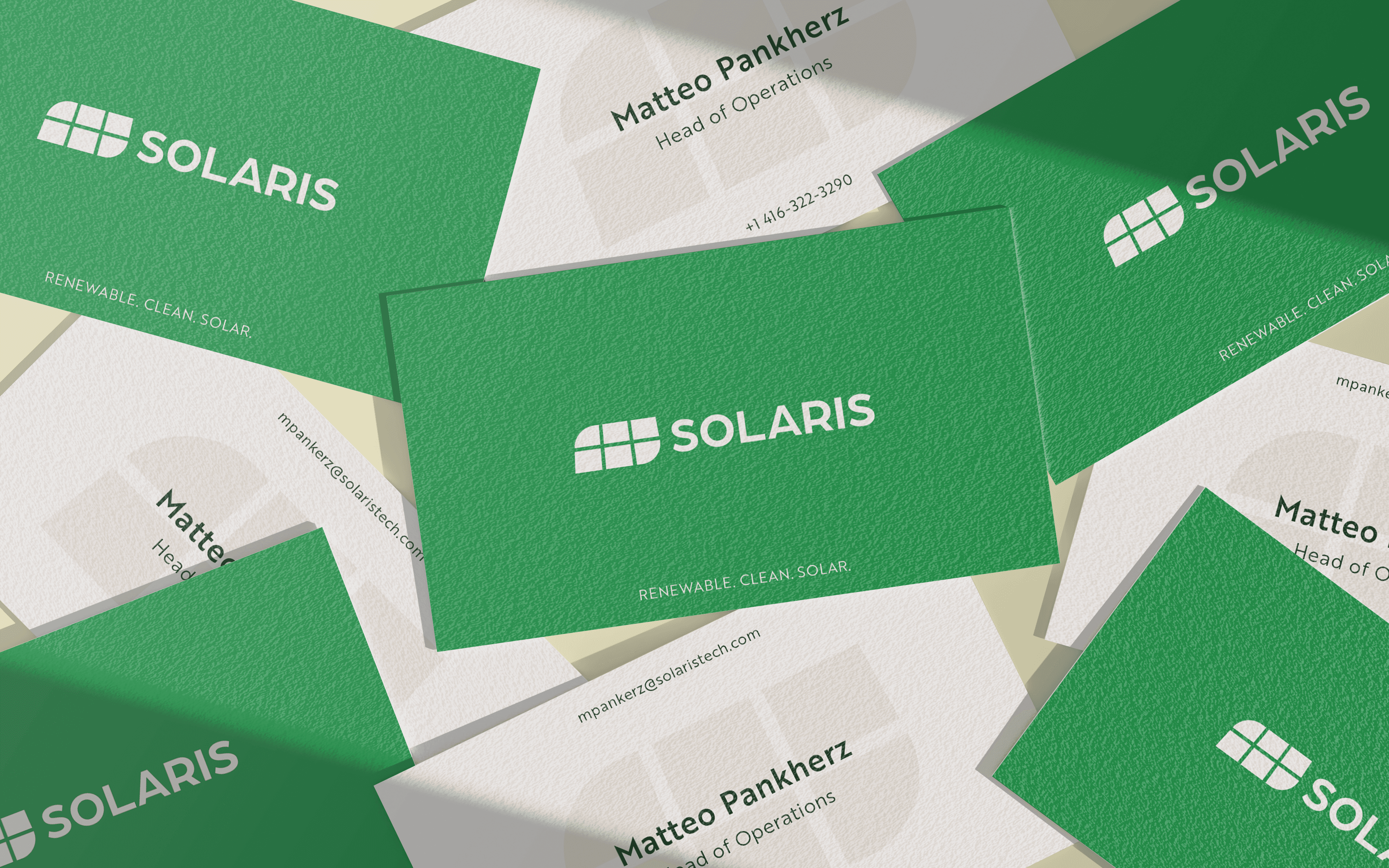
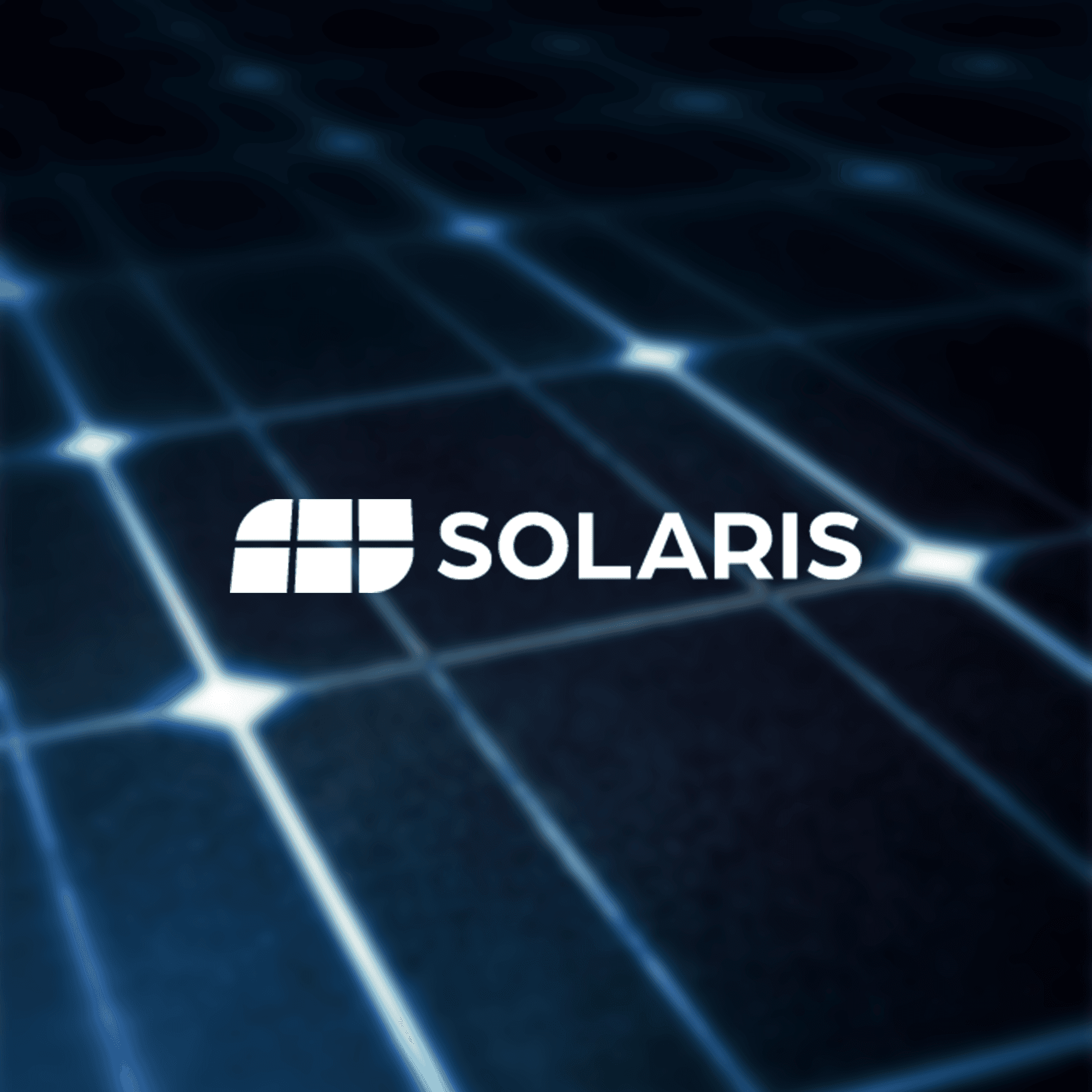
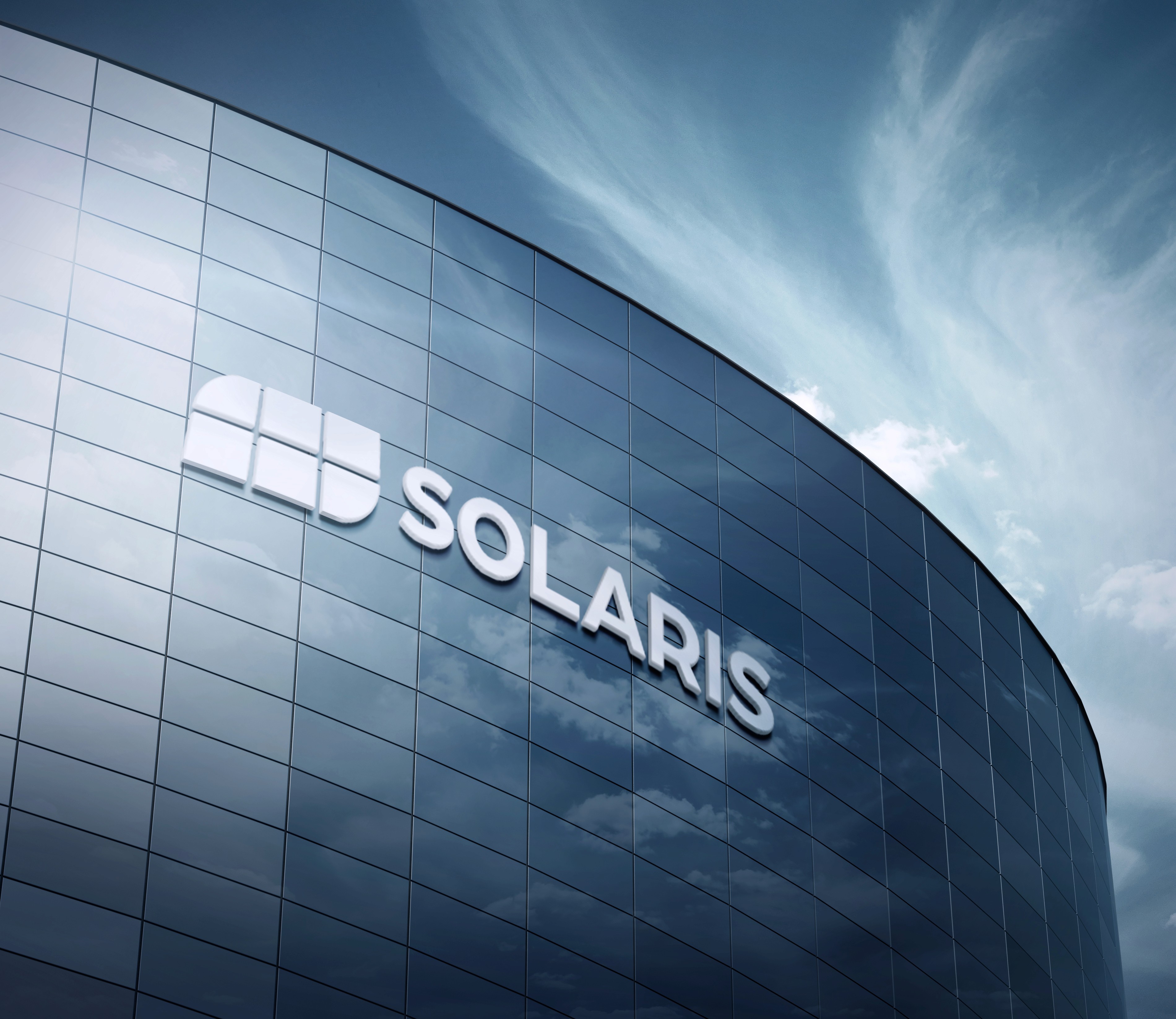
Symbol Breakdown
Logo Mark Analysis
A bold, modular mark inspired by solar grids and sunrise, built to communicate both energy and progress.

The Solaris logo mark was designed with equal focus on function and meaning. The grid pattern references solar panels and clean energy systems, while the rising arc represents the sun and the drive toward progress. Its modular construction ensures it stays clear and recognisable whether on a small digital icon or a large piece of signage. Strong, simple, and adaptable, the mark reflects the innovation and environmental responsibility at the centre of the Solaris identity.
Colour Design
Colour Psychology
The Solaris colour palette balances innovation with environmental responsibility. Emerald green serves as the hero shade, representing growth, sustainability, and clean energy. Pure white conveys trust and transparency, while soft beige adds warmth and approachability. Deep forest green provides depth and professionalism, grounding the brand. Together, these colours create a fresh, modern, and credible visual language that positions Solaris as a forward-thinking leader in renewable energy.
See what I can do for your brand.
Book a call with me today to get started.
Book Your Consultation
Solaris Technology
Solaris is a conceptual mockup for a clean energy, solar technology company. For this fabricated company I created a clean, scalable brand system, designed to inspire trust and communicate innovation.
Company
Solaris Technology
Industry
Technology
Challenge
This conceptual case study imagines Solaris as a modern clean energy company in need of a strong, distinctive identity. The goal was to create a visual system that communicated innovation, technical expertise, and consumer trust, while feeling scalable and adaptable across both digital and physical applications.
Results
The final concept features a bold, modular logo mark inspired by solar panels, energy grids, and the rising sun. Confident typography, a high-contrast palette, and custom 3D iconography give the imagined Solaris brand depth, flexibility, and consistency—positioning it as an innovative, future-ready leader in the clean energy space.
Symbol Breakdown
Logo Mark Analysis
A bold, modular mark inspired by solar grids and sunrise, built to communicate both energy and progress.
The Solaris logo mark was designed with equal focus on function and meaning. The grid pattern references solar panels and clean energy systems, while the rising arc represents the sun and the drive toward progress. Its modular construction ensures it stays clear and recognisable whether on a small digital icon or a large piece of signage. Strong, simple, and adaptable, the mark reflects the innovation and environmental responsibility at the centre of the Solaris identity.
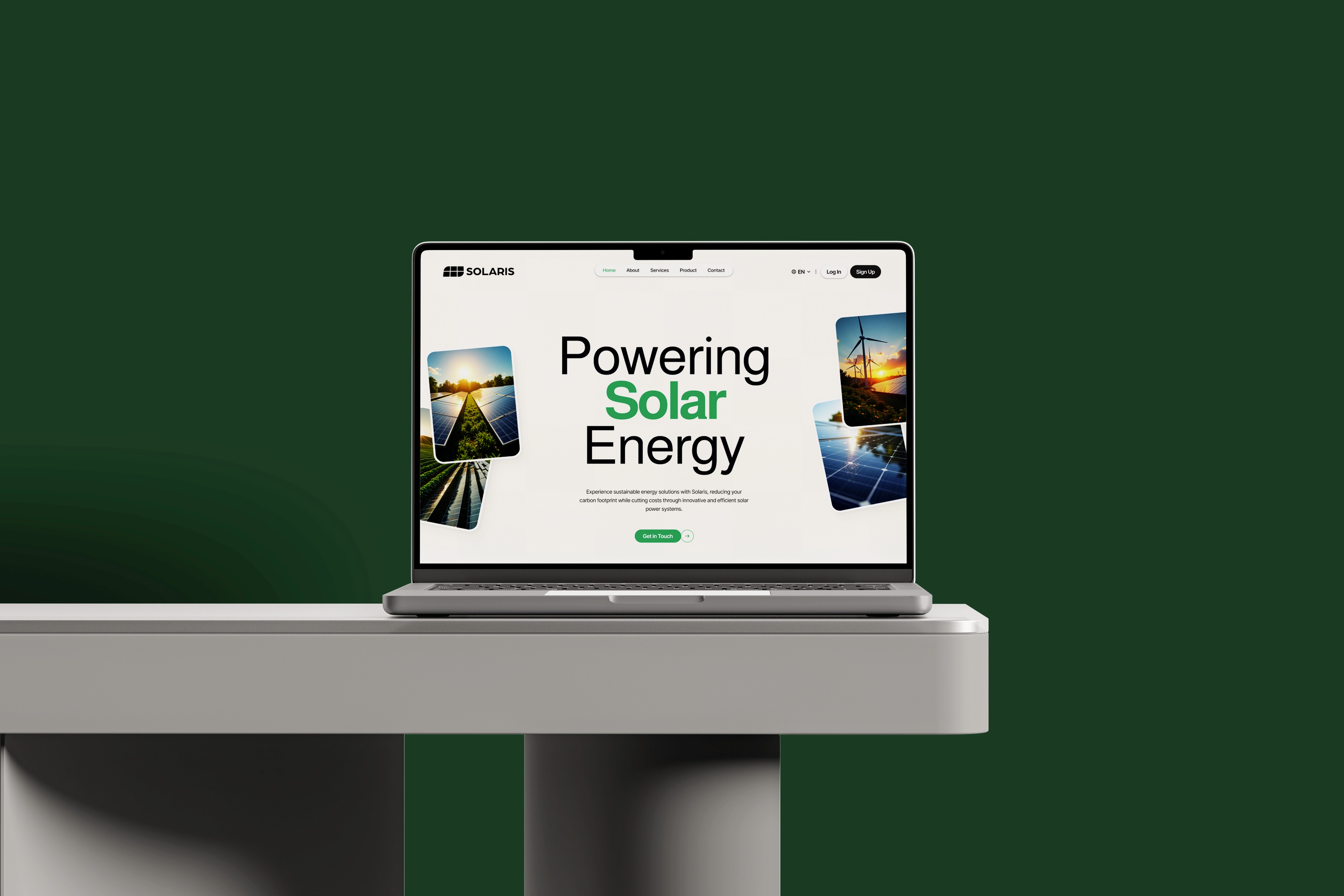
Glyph Conceptualization
Typography Analysis
Designed for legibility and impact, the Solaris type system reflects the brand’s forward momentum—combining geometric precision with clean, approachable forms.
Modern Professionalism
The type system balances boldness with restraint, designed to inspire trust across corporate and consumer markets.
Clarity & Technical Legibility
Each character is highly readable at small sizes—critical for data-heavy dashboards, apps, and printed materials.
Sans-Serif Authority
A geometric sans-serif forms the core of the system, chosen for its clarity, modernity, and engineering-inspired character.
Low-Contrast, High-Impact
Uniform stroke weights support consistency across applications, while allowing UI elements to feel sleek and stable.
Spacing for Digital Rhythm
Generous tracking and line height create a breathable, screen-friendly feel—ideal for clean UI design and sustainability reports.
Brand Presence Through Simplicity
The typography reinforces Solaris’s role as a clean energy leader: confident, credible, and clear.
Colour Design
Colour Psychology
The Solaris colour palette balances innovation with environmental responsibility. Emerald green serves as the hero shade, representing growth, sustainability, and clean energy. Pure white conveys trust and transparency, while soft beige adds warmth and approachability. Deep forest green provides depth and professionalism, grounding the brand. Together, these colours create a fresh, modern, and credible visual language that positions Solaris as a forward-thinking leader in renewable energy.
See what I can do for your brand.
Book a call with me today to get started.
Book Your Consultation
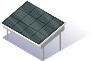
Symbol Breakdown
Custom 3D Iconography
We created a custom suite of 3D icons to support Solaris’s digital ecosystem—bringing life, function, and clarity to complex concepts in a modern, unified style.


Solaris Technology
Solaris is a conceptual mockup for a clean energy, solar technology company. For this fabricated company I created a clean, scalable brand system, designed to inspire trust and communicate innovation.
Challenge
This conceptual case study imagines Solaris as a modern clean energy company in need of a strong, distinctive identity. The goal was to create a visual system that communicated innovation, technical expertise, and consumer trust, while feeling scalable and adaptable across both digital and physical applications.
Results
The final concept features a bold, modular logo mark inspired by solar panels, energy grids, and the rising sun. Confident typography, a high-contrast palette, and custom 3D iconography give the imagined Solaris brand depth, flexibility, and consistency—positioning it as an innovative, future-ready leader in the clean energy space.
Symbol Breakdown
Symbol Breakdown
Logo Mark Analysis
A bold, modular mark inspired by solar grids and sunrise, built to communicate both energy and progress.
The Solaris logo mark was designed with equal focus on function and meaning. The grid pattern references solar panels and clean energy systems, while the rising arc represents the sun and the drive toward progress. Its modular construction ensures it stays clear and recognisable whether on a small digital icon or a large piece of signage. Strong, simple, and adaptable, the mark reflects the innovation and environmental responsibility at the centre of the Solaris identity.
Glyph Conceptualization
Typography Analysis
Designed for legibility and impact, the Solaris type system reflects the brand’s forward momentum—combining geometric precision with clean, approachable forms.
Modern Professionalism
The type system balances boldness with restraint, designed to inspire trust across corporate and consumer markets.
Clarity & Technical Legibility
Each character is highly readable at small sizes—critical for data-heavy dashboards, apps, and printed materials.
Sans-Serif Authority
A geometric sans-serif forms the core of the system, chosen for its clarity, modernity, and engineering-inspired character.
Low-Contrast, High-Impact
Uniform stroke weights support consistency across applications, while allowing UI elements to feel sleek and stable.
Spacing for Digital Rhythm
Generous tracking and line height create a breathable, screen-friendly feel—ideal for clean UI design and sustainability reports.
Brand Presence Through Simplicity
The typography reinforces Solaris’s role as a clean energy leader: confident, credible, and clear.
Colour Design
Colour Design
Colour Psychology
The Solaris colour palette balances innovation with environmental responsibility. Emerald green serves as the hero shade, representing growth, sustainability, and clean energy. Pure white conveys trust and transparency, while soft beige adds warmth and approachability. Deep forest green provides depth and professionalism, grounding the brand. Together, these colours create a fresh, modern, and credible visual language that positions Solaris as a forward-thinking leader in renewable energy.
See what I can do for your brand.
Book a call with me today to get started.
Book Your Consultation
Book Your Consultation
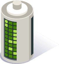
Symbol Breakdown
Custom 3D Iconography
We created a custom suite of 3D icons to support Solaris’s digital ecosystem—bringing life, function, and clarity to complex concepts in a modern, unified style.